 |
Lise Harlev
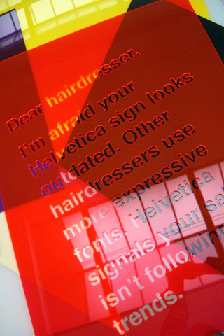
Dear hairdresser
Die langweiligste Schrift, die ich kenne.
American Typewriter is a typeface I love. It makes me think of my favorite American writers from the sixties like Jack Kerouac and Jim Carroll. It seems that anything you write with American Typewriter looks a little like literature from that time.
Comic Sans has been used too much for announcements of birthday parties and anniversaries for me to ever want to use it. Unless in a very ironical way. Comic Sans is just trying too hard to say ”This is fun!”.
Copperplate Gothic reminds me of badly designed business cards. It consists only of capital letters, and yet it contains these slightly bigger letters which are then supposed to be the ”real” capitals. I find that so inconsequent and annoying to look at.
Futura is my favorite typeface. Everybody refers to Helvetica as the typeface you can’t go wrong with, but to me Futura is that kind of eternally beautiful font. It appears professional, but with a touch of avantgarde. I always use Futura for applications.
Times is the most boring typeface I know. The fact that it is the default typeface of most computer programs doesn’t make it any better. If I am using a program which is set to Times, I immediately switch to a different font.
artists overview |
|
|
|
